Begin with hello
The anonymous metch collective.
Before a conversation has a subject, it needs someone willing to begin. We wanted to give that small gesture a place in the collection.
The opening word
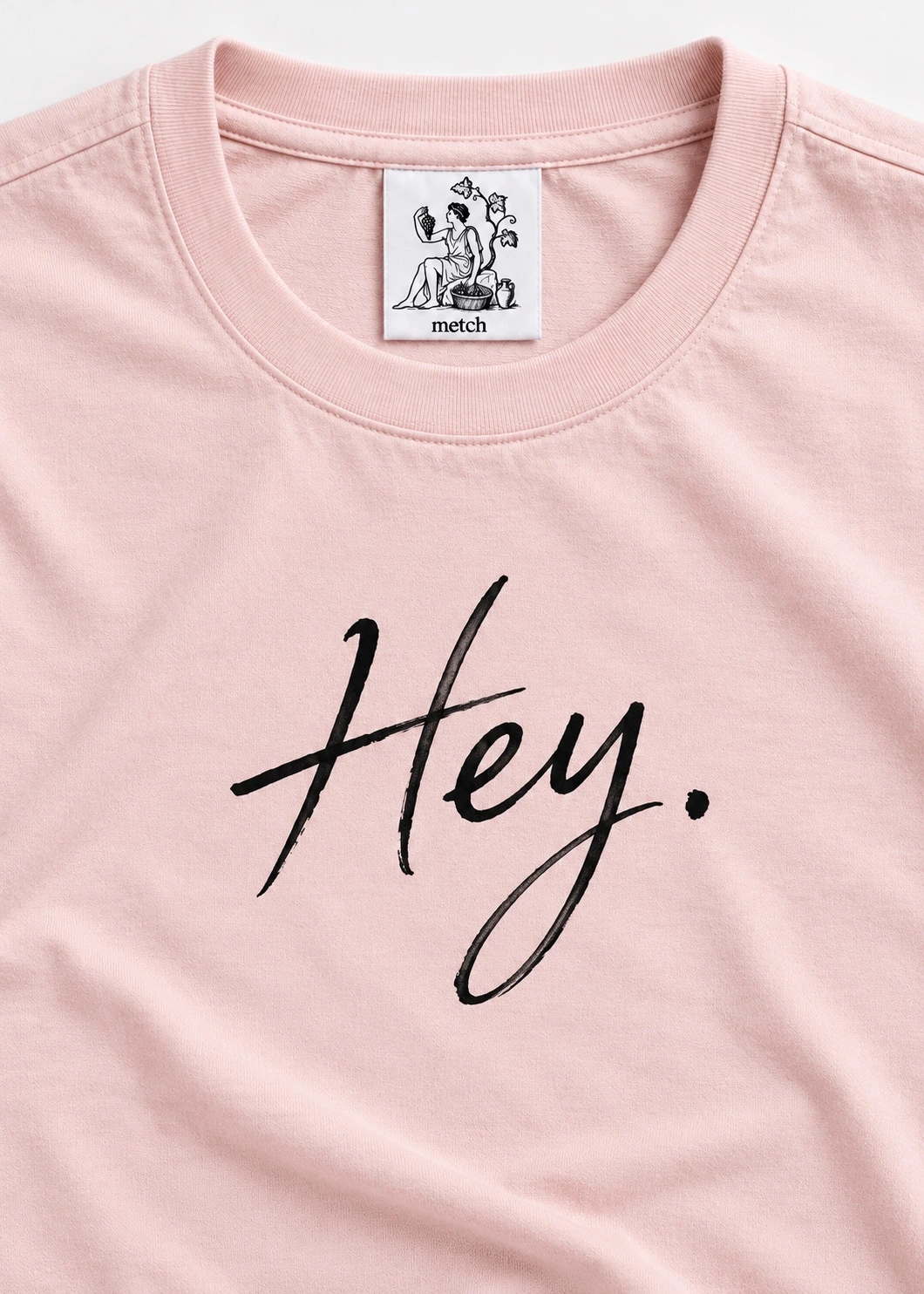
A greeting is a small act of attention. You recognise that another person is there and offer them the beginning of a conversation. While travelling, that beginning can feel more significant because the rest of the sentence is less certain. You may not know the place, the language or how the encounter will unfold. We are interested in the willingness to begin anyway. Hey. puts that gesture into the metch world with a word that does very little explaining. It reaches someone quickly, then leaves the next part open. That openness is where the piece finds its personal character.
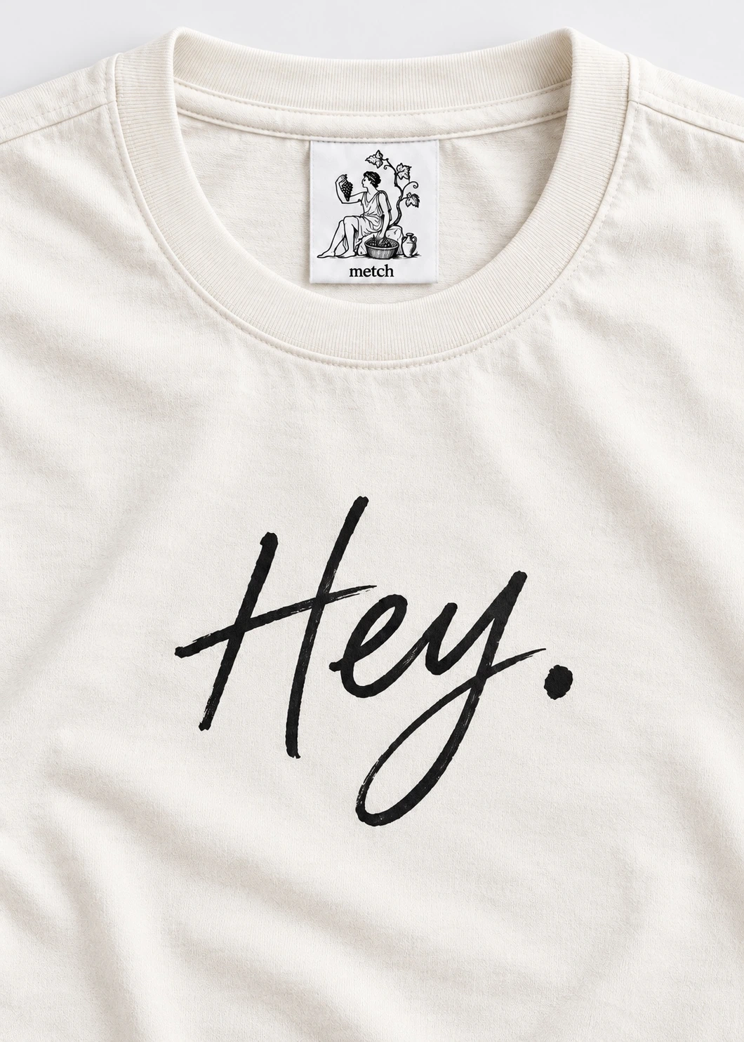
The full stop gives the greeting a particular rhythm. The word has enough confidence to stand on its own, without becoming a command or a question that demands an answer. The handwritten character keeps it close to the scale of a person. We want it to feel like a greeting you could actually make, rather than a line written to describe the idea of friendliness. Black on white gives it clarity. There is no other colour to move the eye away from the shape of the word. The relationship between the gesture and the ground has to do the work.
A familiar shape
The men's tee gives the greeting a familiar structure: a crew neck, short sleeves and a white surface. Familiarity matters because it allows the lettering to enter the garment without making every part of the piece compete for an introduction. We like the tension between an everyday shape and a mark with a clear voice. The word does not have to occupy every available space to feel present. The eye can recognise the whole tee and then return to the handwriting. That second look is where the design becomes more specific than the word alone.
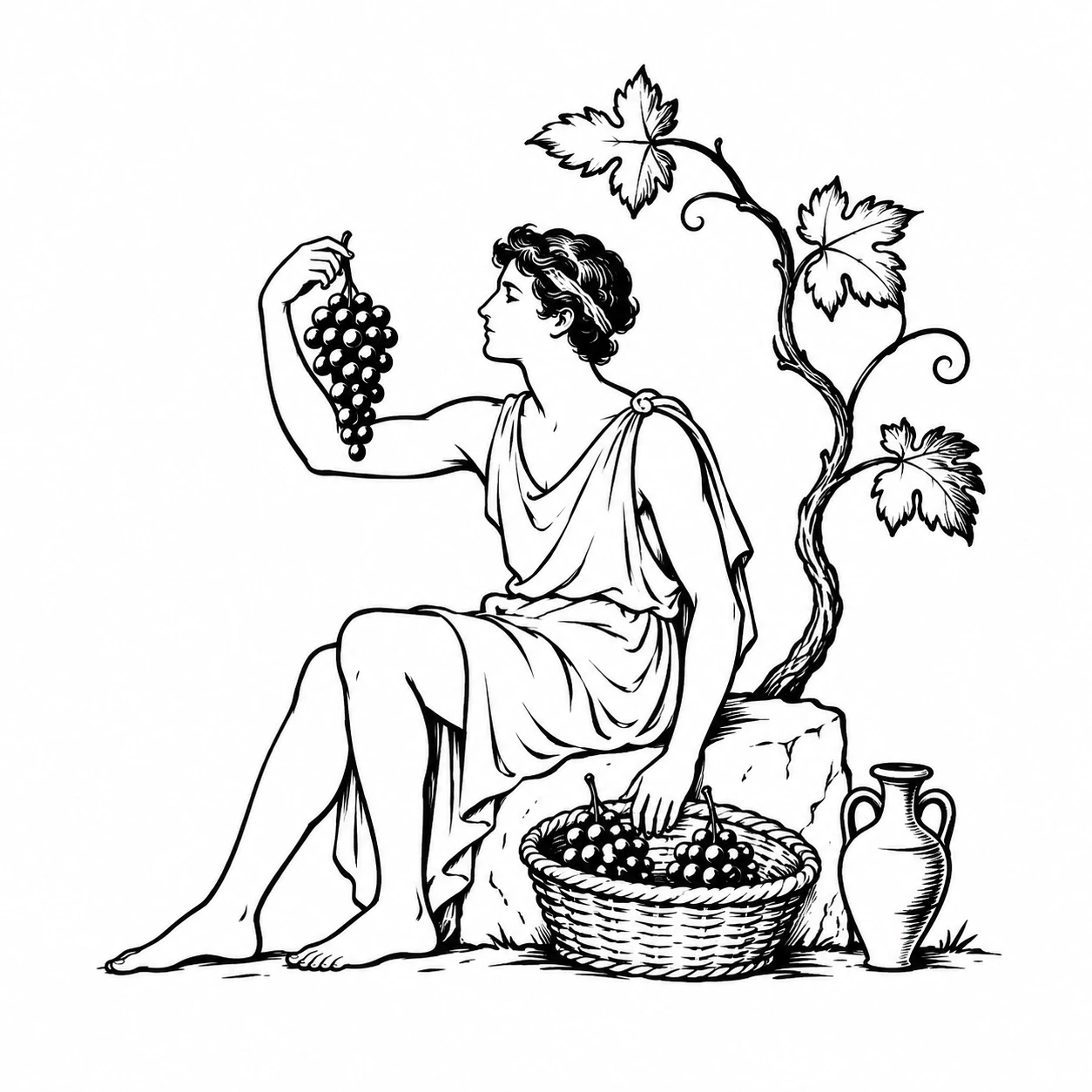
A harvest mark appears low on the back, with a related label inside the neck. Those details make the greeting part of the collection's wider language. The chest begins a conversation with the outside world. The reverse gives someone a different point of recognition. The label belongs first to the person holding or wearing the piece. We think about these views together because a garment continues to exist when its most obvious graphic is out of sight. The small marks help it keep its character. They give the piece a complete introduction without repeating the same word on every surface.
Leave room to answer
A simple design puts a great deal of importance on proportion. The size of the handwriting, the space around it and its relationship to the neck all shape the impression of the word. The design discussion is about how these parts work together. Too much surrounding explanation would take away the directness we value in the greeting. The tee has to make sense before someone reads this page. The story can then show you why we keep returning to a small gesture that most people make without thinking about it. Everyday language contains more feeling than its brevity might suggest.
Hey. expresses the side of metch that wants to meet people without arriving with a public personality attached. Our artists remain anonymous. The greeting goes ahead of the name and leaves the encounter to develop on its own terms. Perhaps the word brings a particular person to mind. Perhaps it becomes the thing you wear when you feel ready to enter a room or begin a conversation you have been putting off. Those associations can make a familiar greeting specific to you. We provide the opening word. The relationship that follows can take its own shape.