A heart left open
The anonymous metch collective.
A heart is easy to recognise. The harder question is how to let it feel like something a person has actually meant.
An ordinary symbol
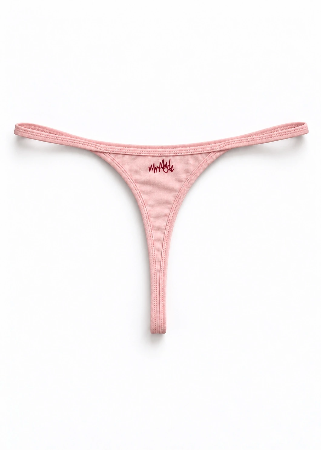
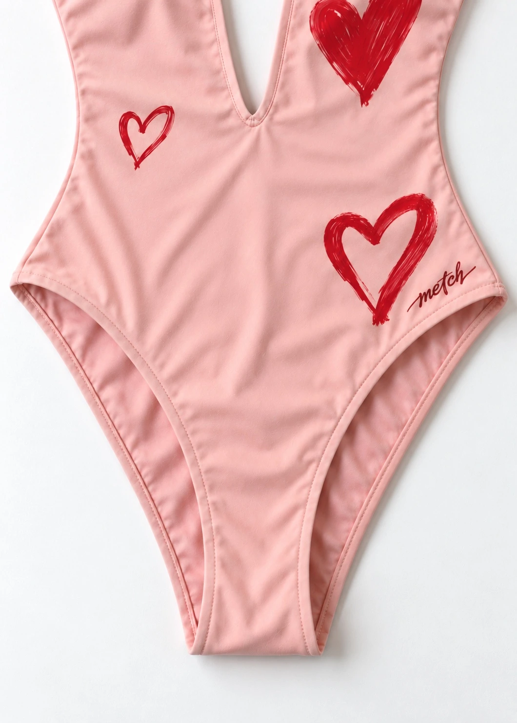
We are interested in symbols people already understand. A heart reaches someone before they have read a description or recognised a label. That familiarity gives it a particular difficulty. It can become automatic, a shape used so often that the feeling inside it disappears. With Hearts, we want to hold on to the directness of the symbol while making room for a more personal reading. The red artwork has the immediacy of a mark left on paper. It is allowed to be expressive. The blush ground lets that expression remain close to the body rather than floating as a graphic on its own.
Travelling changes the way you notice affection. A person waiting while you find a ticket. A message asking whether you arrived. Someone remembering the small thing you needed. Our European travels are part of the collection's wider inspiration, and we bring that kind of attention to this piece. We are less interested in giving love a perfect image than in recognising how it appears in ordinary gestures. The heart can carry that idea because it is already shared. You do not need an introduction to the shape. You can bring your own experience to it immediately.
Red against pink
Red on blush gives the heart a particular voice. The colours are related, but they do different work. The pink holds the surface together. The red makes a clear interruption inside it. Look closely and the artwork asks for attention; look at the whole piece and it becomes part of a larger silhouette. We think that movement between close and distant views matters. A garment should offer more than the version of itself that fits into a small photograph. Its details have to keep speaking when your eye moves away from the exact place you first noticed.
The front and back are part of the same design question. A plunging neckline shapes the front. The open back and its tie fastening make a different line on the reverse. These openings give the artwork a body around which to arrange itself. The small metch signature belongs to the composition without becoming its subject. We want the eye to move between the heart, the colour and the outline of the piece. Each view changes the emphasis. That is where the design finds a more intimate character than a symbol placed on an otherwise unrelated surface.
Keeping it open
Our work on the idea is a process of questioning how much a familiar mark should say. Make it too polite and it loses its feeling. Ask it to explain everything and the garment becomes crowded with a message. The version you see keeps the heart direct and the surrounding design clear. We like that a simple shape can remain open to different kinds of affection: towards another person, towards a place, towards a version of yourself you are learning to give time to. Those meanings can coexist. The artwork does not need to select one on your behalf.
Hearts is an invitation to let an ordinary symbol become personal again. It can gather a memory of water, a day spent away or the feeling of being comfortable in your own company. We do not put a named artist in front of that experience. The collective remains anonymous and the piece is allowed to stand in the light on its own. What matters is the encounter between the red mark and the person wearing it. The heart may be familiar to everyone. The meaning it carries for you can still belong to nobody else.