Two marks in red
The anonymous metch collective.
We want the hoodie to have a clear voice at the front and enough quiet around it for the person wearing it.
A familiar place
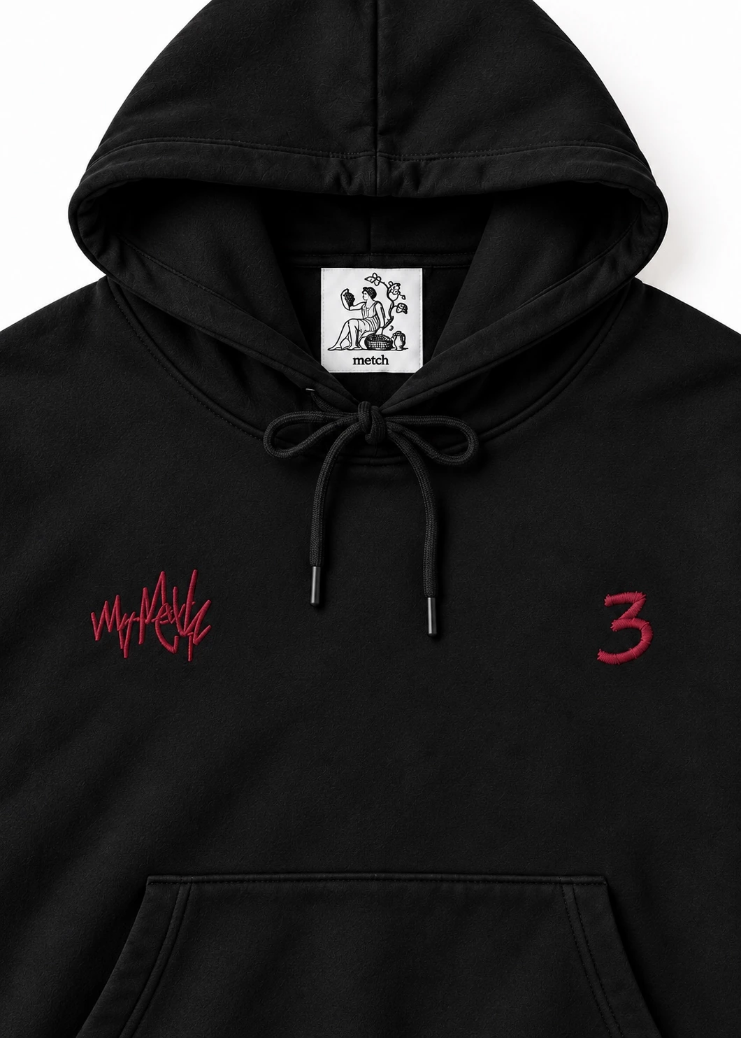
A hoodie has a particular place in a wardrobe. The hood, the pocket and the way the body of the garment is framed by its cuffs are familiar before any mark is added. We like beginning with that recognition. It gives the design a human scale. Someone can approach the piece through a shape they already understand, then discover what makes this version specific. In black, the silhouette holds together as one clear field. The burgundy-red marks arrive within it as small interruptions, with enough room around them for each to keep its own character.
We think about a garment like this through the everyday moments it may enter. A journey between places, an evening that carries on a little longer, the decision to pull on something familiar before leaving. Those associations belong to the person wearing the piece. Our part is to give the familiar shape a point of view without filling it with a complete identity on their behalf. The hood and the large front pocket remain central to the first impression. The marks are part of that impression, while leaving the person inside the garment room to be themselves.
A word and a number
There are two different gestures at the chest. The handwritten mark has movement inside its line. The small 3 is more immediately recognisable as a single sign. Their separation gives the eye a relationship to follow across the front. We like the difference between them: one asks you to look at the character of a line, while the other can be recognised almost at once. Neither needs to grow large enough to take over the whole piece. The black becomes an active part of the arrangement, holding the distance between the marks as carefully as the colour holds them together.
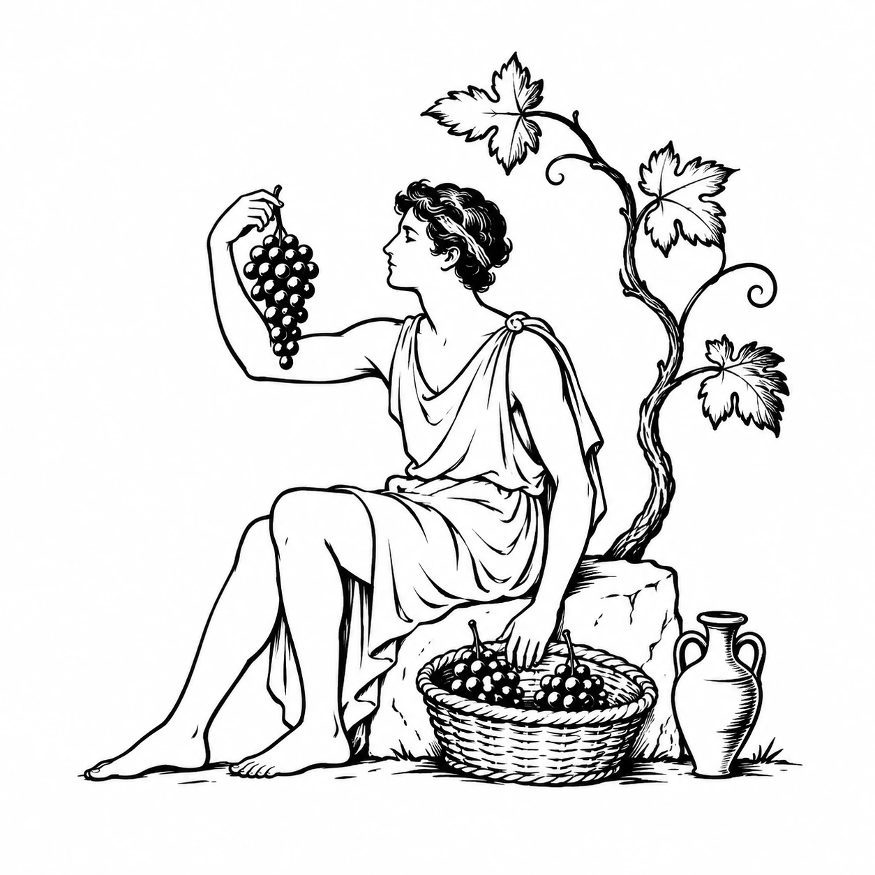
Burgundy red brings a warmer voice to this part of the collection. Against black, its presence is clear without becoming the only thing you see. The drawstrings introduce another pair of lines above the artwork. Lower down, the kangaroo pocket changes the surface and gives the front its everyday structure. Inside the hood, the harvest label connects the piece to the collective's shared image. It belongs first to the person picking up the hoodie, before the outside meets anyone else. We want those different encounters with the garment to feel related without repeating exactly the same statement.
Room on the reverse
The back remains unprinted. That decision gives the piece a different kind of presence when the wearer turns away. The outline of the hood and the shape of the shoulders become the main things to notice. We are interested in letting a garment change its emphasis across its different views. A clear front does not require an equally busy reverse. Each side can do its own work. The small red marks can remain a memory of the first view while the black silhouette takes the lead in the next.
For us, the hoodie is a study in how much character a few elements can carry together. The handwriting, the number, the pocket and the hood each have a distinct role. We leave the number open to the associations a person may bring to it, without assigning it a borrowed biography. The artists remain anonymous for a similar reason. A public identity should not stand between you and the work. Look at the piece, find the detail that stays with you and let it gather a place in your own life. That relationship is where its character continues to develop.